T-Shirt Logo Placement Guide: A Comprehensive Overview (12/10/2025)
Today, December 10th, 2025, mastering t-shirt design and logo placement is crucial for impactful branding; this guide details dimensions and techniques for professional results!
Effective logo placement elevates your t-shirt from simple apparel to a powerful marketing tool, ensuring visibility and brand recognition with every wear.
Understanding the Importance of Logo Placement
Strategic logo placement on a t-shirt transcends mere aesthetics; it’s a fundamental aspect of brand communication and marketing. A well-positioned logo enhances brand visibility, creating a walking advertisement with every wearer. Consider that the placement directly impacts how the logo is perceived – a central chest placement conveys authority, while a sleeve placement offers subtle branding.
Poor placement can diminish the logo’s impact, distorting the design or clashing with the t-shirt’s seams. Thoughtful consideration of dimensions and positioning ensures the logo complements the garment and effectively communicates the brand’s identity. Ultimately, impactful logo placement drives brand recognition and fosters customer loyalty.
Key Considerations Before You Start
Before finalizing t-shirt logo placement, meticulous planning is essential; First, deeply understand your target audience and how the logo’s position aligns with their preferences and the overall brand identity. Second, carefully evaluate the t-shirt style and fabric; a heavier fabric can accommodate bolder designs, while lighter fabrics suit minimalist approaches.
Consider the logo’s complexity – detailed designs require ample space, while simple logos can be subtly placed. Ignoring these factors risks a design that feels out of place or loses its impact. Prioritize a cohesive look that enhances both the garment and the brand message.
Target Audience & Brand Identity
Understanding your target audience is paramount; their age, interests, and style preferences dictate appropriate logo placement. A youthful demographic might embrace bolder, unconventional placements, while a professional audience prefers classic, understated designs. Your brand identity should also guide decisions.
Is your brand playful or sophisticated? Minimalist or maximalist? The logo’s position should reinforce these qualities. A luxury brand might opt for subtle chest embroidery, while an activewear brand could utilize sleeve or full-front prints. Aligning placement with brand values ensures a consistent and impactful message.
T-Shirt Style & Fabric
T-shirt style significantly impacts logo placement; a crew neck offers different opportunities than a V-neck. Consider the cut – a slim fit may require smaller, more streamlined designs, while a relaxed fit allows for larger, bolder graphics. Fabric also plays a role.
Heavier fabrics can support more detailed prints, while lighter fabrics benefit from simpler designs. Textured fabrics might distort intricate logos, necessitating careful consideration of size and placement. The drape and stretch of the fabric influence how the logo appears when worn, impacting overall visual appeal.
Common T-Shirt Logo Placement Options
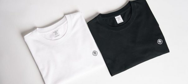
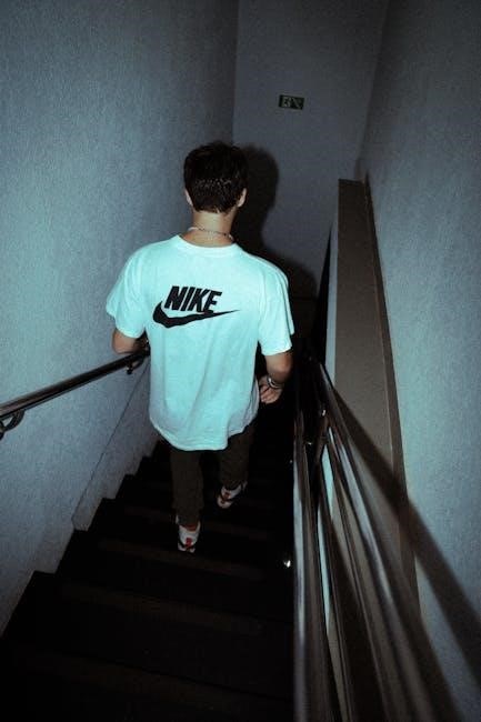
Logo placement varies greatly, offering diverse branding opportunities. Center chest placement is classic and impactful, ideal for bold designs. Left chest placement, resembling a pocket area, provides a subtle, traditional look. Full front placement maximizes visibility, best suited for detailed graphics, roughly 3 inches down from the neckline.

These are foundational options, but creative exploration is encouraged. Consider the garment’s overall aesthetic and the logo’s design when selecting the optimal location. Each placement style conveys a different brand message and aesthetic.

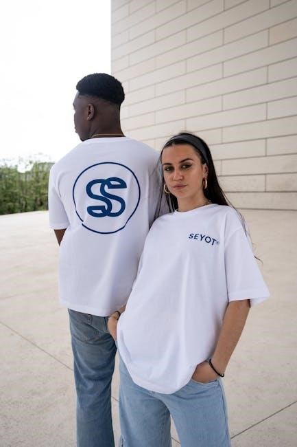
Center Chest Placement
Center chest placement is arguably the most recognizable and versatile t-shirt logo location. It’s ideal for showcasing brand emblems, impactful graphics, or concise text. This placement commands attention, making it suitable for primary branding statements. A typical size ranges from 10-12 inches wide and 10-14 inches tall, depending on the design’s complexity.
Ensure the design is centered horizontally and vertically for a balanced aesthetic. This classic approach works well with various t-shirt styles and fabrics, offering broad appeal and maximum visibility.
Left Chest Placement (Classic Pocket Area)
Left chest placement, often mimicking a classic pocket design, offers a subtle yet sophisticated branding option. This area is perfect for smaller logos, initials, or minimalist graphics. It conveys a sense of understated elegance and is well-suited for workwear or casual styles. The typical size is considerably smaller than center chest, usually around 3-4 inches wide and 3-5 inches tall.
Positioning is key; align the logo neatly above the left pocket (or where a pocket would be); This placement is ideal for brands aiming for a refined, less ostentatious look.
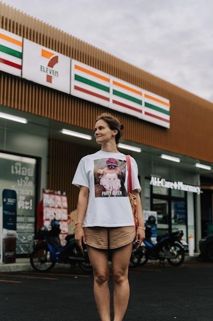
Full Front Placement
Full front placement delivers maximum visual impact, making it ideal for bold designs and detailed artwork. This option allows for larger logos and intricate graphics, commanding attention immediately. A common size range is 10-12 inches wide and 10-14 inches tall, though this varies with the design’s complexity and the t-shirt’s size.
Positioning is crucial – roughly 3 inches down from the neckline ensures visibility without distortion. This placement works exceptionally well for brands wanting to make a strong statement and showcase their creativity. Consider the overall balance of the design.
Detailed Dimensions & Positioning
Precise dimensions and careful positioning are vital for a professional t-shirt design. Standard logo sizes fluctuate based on placement; center chest typically uses smaller designs (3-4 inches), while full front allows for larger ones (10-12 inches wide).
Vertical positioning requires attention to the neckline (around 3 inches down) and hem to avoid awkward cropping; Horizontal centering is standard, but off-center designs can create unique aesthetics. Accurate measurements and mockup previews are essential before printing, ensuring a balanced and visually appealing final product.
Standard Logo Sizes for Different Placements
Logo size dramatically impacts visual appeal, varying by placement. Center chest placement generally suits logos 3-4 inches wide and tall, maintaining balance. Left chest (pocket area) logos are smaller, around 2-3 inches, for subtle branding.
Full front placement accommodates larger designs, often 10-12 inches wide and 10-14 inches tall, allowing for detailed graphics. Consider fabric stretch; slightly smaller sizes prevent distortion. Always preview mockups to confirm proportional harmony and readability before finalizing your print order.
Vertical Positioning: Distance from Neckline & Hem
Vertical logo placement significantly affects the overall aesthetic. For full front designs, position the logo roughly 3 inches down from the neckline, ensuring comfortable visibility. Center chest and left chest logos benefit from similar spacing, avoiding encroachment on the collar.
Maintain at least 2-3 inches of space between the logo’s bottom edge and the t-shirt hem, preventing a cramped appearance. Consider the wearer’s body shape; adjust slightly for optimal visual balance and a polished, professional look.
Horizontal Positioning: Centering & Off-Center Designs
Centering logos horizontally creates a classic, balanced look, ideal for most t-shirt designs. Ensure equal space on both sides for visual harmony. However, off-center designs can add a modern, artistic flair.
When opting for asymmetry, carefully consider the logo’s weight and balance. A smaller logo might look best positioned towards the left or right, while larger designs require more strategic placement. Experiment with different alignments to achieve a unique and eye-catching aesthetic, avoiding a lopsided appearance.
Placement for Specific Logo Types
Bold & detailed designs thrive with full front placement, allowing ample space for intricate details to shine – roughly 3 inches down from the neckline. Minimalist logos & text excel with left chest placement (classic pocket area), offering a subtle yet sophisticated branding touch.
Small iconography benefits from strategic center chest placement or even sleeve positioning for a unique accent. Consider the logo’s complexity and size when choosing a location; simplicity often works best in smaller areas, while detailed designs need room to breathe.
Bold & Detailed Designs

Bold and detailed designs demand significant visual space to avoid appearing cluttered or losing crucial elements. Full front placement is ideal, typically around 10-12 inches wide and 10-14 inches tall, positioned approximately 3 inches below the neckline. This allows for maximum impact and ensures all intricacies are clearly visible.
Avoid compressing these designs; maintain clarity and sharpness. Consider the fabric – smoother fabrics showcase detail better. Careful consideration of scale is vital; overly large designs can overwhelm, while too small renders details indiscernible.
Minimalist Logos & Text
Minimalist logos and text thrive on subtlety and strategic placement. Left chest placement (the classic pocket area) is often perfect, conveying understated sophistication. Sizes should be smaller, typically 3-4 inches wide, ensuring they complement, not dominate, the garment.
Center chest placement also works, but scale down the logo significantly. Consider using a clean, legible font for text-based designs. Avoid overly complex arrangements; simplicity is key. The goal is refined branding, not a loud statement. Fabric choice matters – a crisp print on quality material enhances the minimalist aesthetic.
Small Iconography

Small iconography, like icons or simple graphics, offers versatile placement options. Sleeve placement (left or right bicep) is ideal for subtle branding, adding a unique touch without being overly prominent. Consider the icon’s size – generally 2-3 inches is sufficient – and ensure high-resolution artwork for crisp reproduction.
Back of neck placement provides another discreet option. Full front placement can work, but repeat the icon in a pattern for visual interest. Avoid isolating a single, tiny icon on a large expanse of fabric. Prioritize clarity and ensure the iconography remains recognizable even at a reduced scale.
Advanced Placement Techniques
Advanced placement techniques move beyond traditional logo placement, offering unique branding opportunities. All-over prints and repeat patterns create a bold, immersive design, demanding high-quality artwork and careful consideration of fabric drape. Sleeve placement – on either the left or right sleeve – adds subtle detail, ideal for smaller logos or icons.
The back of neck placement offers a discreet branding option, perfect for minimalist designs. Experiment with asymmetrical layouts for a modern aesthetic. Remember to consider how these techniques impact the overall garment cost and production complexity.
All-Over Prints & Repeat Patterns
All-over prints and repeat patterns transform a t-shirt into a dynamic canvas, demanding high-resolution artwork and precise color management. These designs require careful consideration of seam allowances and pattern alignment to avoid distortion. Sublimation is often preferred for vibrant, durable results on polyester fabrics.
Successful repeat patterns utilize cohesive color palettes and balanced compositions. Ensure the design complements the t-shirt’s style and target audience. Complex patterns can increase production costs, so factor this into your budget. Consider the visual impact and brand message conveyed by the overall design.
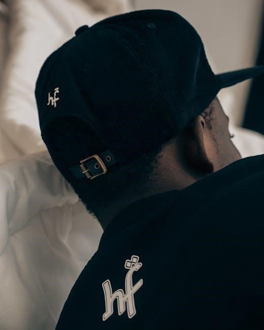
Sleeve Placement (Left & Right)
Sleeve placement offers a subtle yet effective branding opportunity, ideal for minimalist logos or icons. Left sleeve placement is traditional, while right sleeve branding creates visual interest and asymmetry. Consider the t-shirt’s sleeve style – set-in sleeves offer more placement options than raglan sleeves.
Logo size on sleeves should be smaller than chest placements to maintain balance. Ensure the design doesn’t interfere with arm movement or comfort. This placement is excellent for secondary branding elements or supporting a larger chest logo. Consistent placement across multiple t-shirts is vital for brand recognition.
Back of Neck Placement (Subtle Branding)
Back of neck placement provides a discreet branding option, perfect for logos that don’t need to be immediately prominent. This area is ideal for smaller logos, initials, or taglines, offering a sophisticated touch. It’s a great location for reinforcing brand identity without overwhelming the overall t-shirt design.
Ensure the logo is legible but not overly large, considering the curvature of the neck. This placement works well with various t-shirt styles and fabrics. It’s a subtle way to build brand awareness and create a premium feel, appealing to customers who appreciate understated elegance.
Avoiding Common Placement Mistakes
Common mistakes in t-shirt logo placement can significantly detract from the design’s impact. Logo distortion occurs when placement doesn’t account for fabric stretch or garment shape, leading to a warped image. Placement conflicts with seams or pockets create an unprofessional look and hinder visibility.
Avoid using logos that are overly large or small; scale is crucial for readability and aesthetic balance. Careful consideration of these factors ensures a polished, professional finish. Prioritize accurate mockup previews and test prints to identify and rectify potential issues before full production, saving time and resources.
Logo Distortion Due to Placement
Logo distortion is a frequent issue stemming from improper t-shirt logo placement. Garment stretching, particularly during wear, can warp images if the design isn’t strategically positioned. Curved areas, like shoulders or sleeves, present challenges; designs must accommodate these contours.
Consider fabric type – knit fabrics stretch more than woven ones. Always utilize mockup templates to visualize how the logo will appear on a body. Test prints are vital to confirm the design’s integrity post-application. Careful attention to these details prevents a visually jarring and unprofessional final product.
Placement Conflicts with Seams & Pockets
T-shirt logo placement must avoid conflicts with seams and pockets to maintain visual appeal and design clarity. Placing a logo directly over a seam can cause distortion or an uneven appearance as the garment moves. Similarly, logos near pockets risk being obscured or appearing cramped.
Maintain sufficient spacing – at least half an inch – from these features. Consider how the pocket lies when the shirt is worn; a flat pocket requires less clearance than a bulky one. Careful planning prevents a cluttered or compromised design, ensuring a polished and professional final product.
Overly Large or Small Logos
T-shirt logo sizing is critical; an overly large logo can overwhelm the garment and appear garish, dominating the wearer instead of complementing their style. Conversely, a logo that’s too small may become lost or illegible, failing to deliver the intended branding message.
Consider the placement area and the overall t-shirt design. A balanced approach ensures the logo is noticeable yet proportionate. Test different sizes with mockups to visualize the final result. Prioritize readability and impact – the logo should be easily identifiable from a reasonable distance.
Tools & Resources for Accurate Placement
Design software like Adobe Illustrator or Photoshop, featuring mockup templates, are invaluable for visualizing logo placement before production. These tools allow for precise adjustments to size and positioning, preventing costly errors. Utilize online t-shirt design platforms offering similar features for ease of use.
Always adhere to print-ready file preparation guidelines provided by your printing service. This includes vector formats, resolution requirements, and color profiles. Proper file preparation ensures optimal print quality and accurate reproduction of your design.
Design Software with Mockup Templates
Adobe Illustrator and Photoshop are industry standards, offering robust tools for creating and manipulating designs. Utilize their mockup templates – pre-designed t-shirt layouts – to visualize logo placement realistically. These templates simulate fabric texture and drape, aiding in accurate dimension assessment.
Alternatively, explore user-friendly online platforms like Canva or Placeit, which provide pre-made t-shirt mockups and drag-and-drop functionality. These are ideal for quick previews and experimentation with different sizes and positions before finalizing your design.
Print-Ready File Preparation Guidelines
Vector graphics (like .AI or .EPS) are preferred for scalability without losing quality, crucial for various t-shirt sizes. Ensure your logo is at least 300 DPI for sharp prints. Convert all text to outlines to avoid font compatibility issues during printing.
Submit files in CMYK color mode, as this matches the printing process. Include bleed areas (typically 0.125 inches) to prevent white edges. Clearly indicate logo placement and dimensions in your file notes. Confirm specific requirements with your chosen printing service.